
Introduction
Color is one of the most powerful tools in interior design. It influences how we feel, how we behave, and even how we perceive the dimensions of a space. Beyond aesthetic appeal, color holds psychological and emotional weight, subtly shaping human experience within interiors. Whether designing a calm sanctuary, an energizing workspace, or an inviting retail environment, understanding the psychology of color enables designers to create spaces that not only look good but feel right. This article explores the science and strategy behind color use in interior design and how it can be intentionally applied to evoke emotion, define function, and reinforce identity.""""""
Understanding Color Psychology
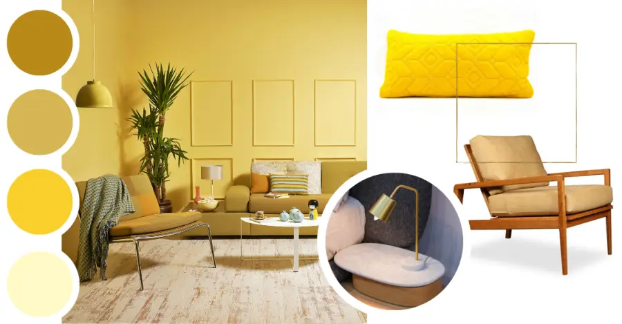
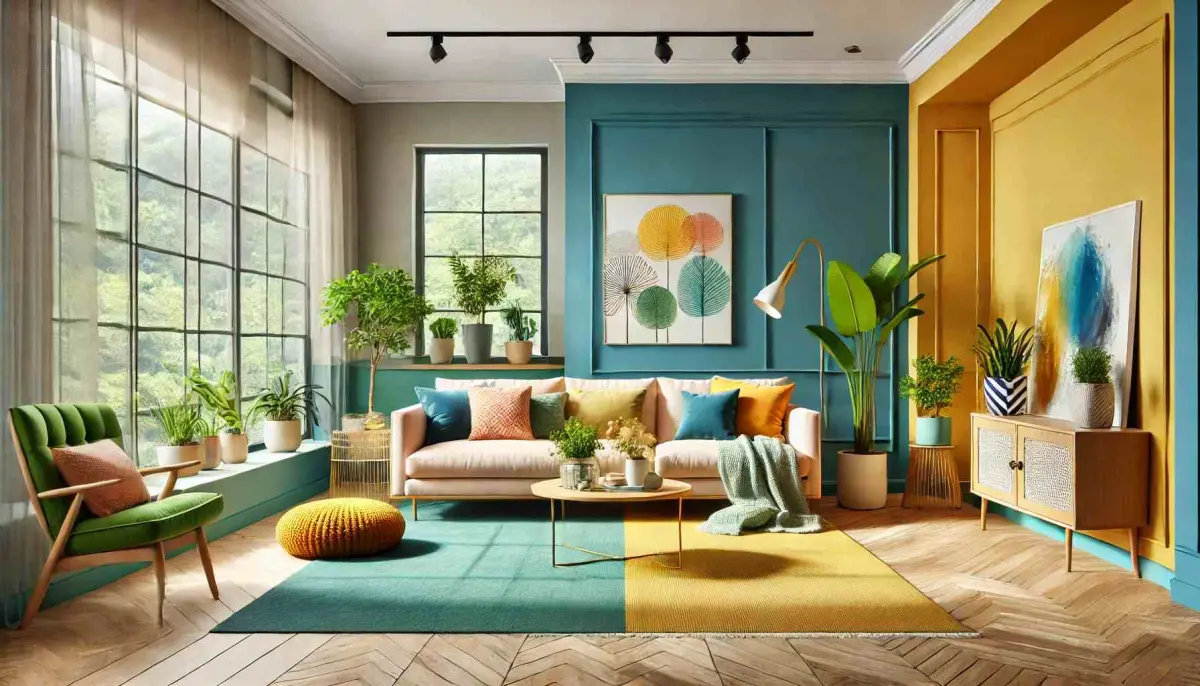
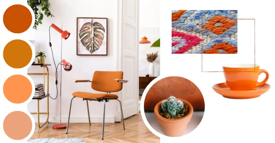
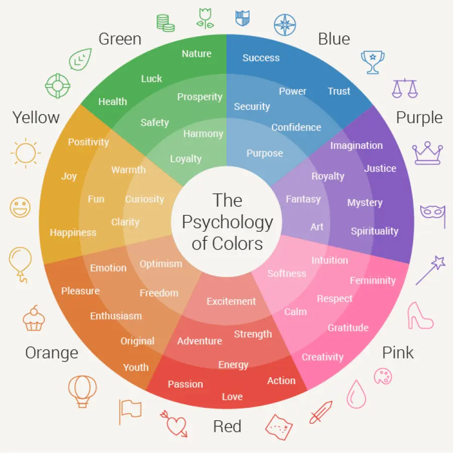
Color psychology is the study of how colors affect perception and behavior. While reactions to color can be subjective and influenced by personal experiences or cultural background, certain emotional associations are commonly shared across societies. Red is stimulating, passionate, and attention-grabbing. It increases heart rate and energy, making it effective in dining areas or social zones. Blue evokes calmness, trust, and clarity. It is ideal for offices, bedrooms, or wellness spaces. Green is associated with nature, balance, and renewal. It promotes tranquility and can reduce eye strain. Yellow brings optimism and cheerfulness. It works well in kitchens, entrances, and creative spaces. Purple signifies luxury, creativity, and spirituality. It can bring drama or sophistication depending on its intensity. Neutral tones like beige, gray, white, and black serve as versatile backdrops and can either soothe or sharpen depending on how they’re used. These effects are not purely psychological—they are biological. For example, warmer colors like red and orange can raise alertness and body temperature, while cooler tones like blue and green can induce calm and lower stress."
Color Theory in Interior Design
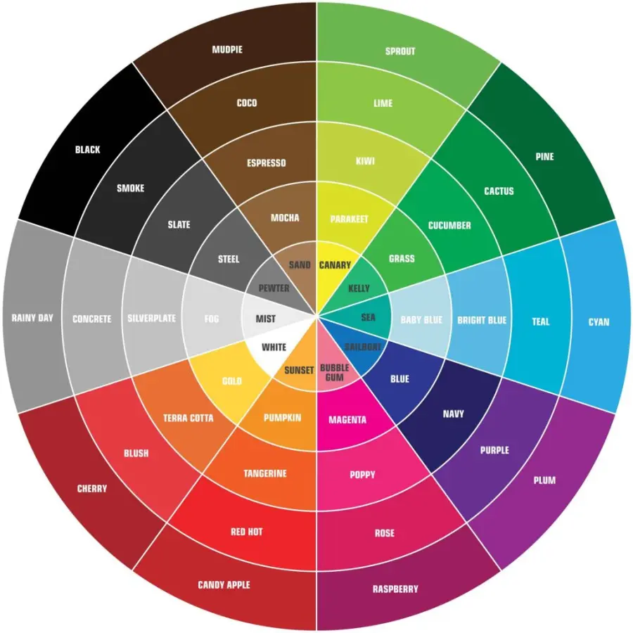
To apply color effectively, designers often rely on color theory, which includes understanding: The color wheel: Primary, secondary, and tertiary colors. Color schemes: Monochromatic: Using variations of a single hue. Analogous: Combining neighboring colors on the wheel. Complementary: Opposite colors for high contrast. Triadic: Equally spaced colors for balance and vibrancy. Hue, saturation, and value: Adjusting color intensity and lightness to influence mood and atmosphere. Strategic color planning creates harmony within a space, enhances flow from one room to another, and aligns visual language with brand identity or personal style.
Color and Function: Matching Color to Room Purpose
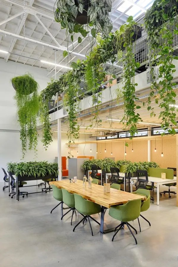
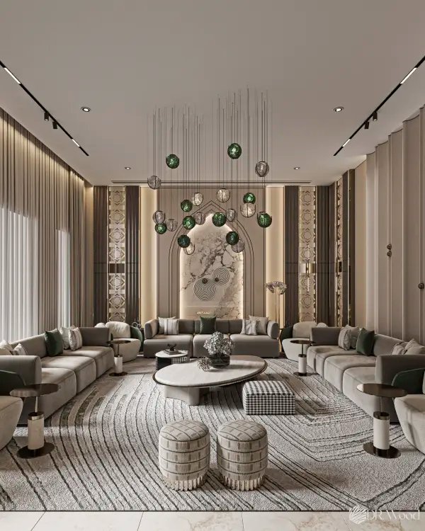
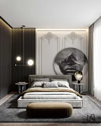
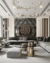
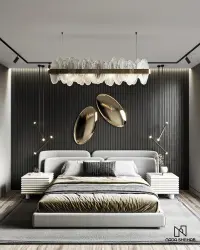
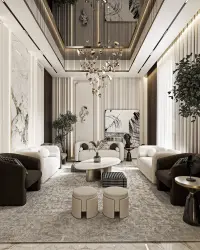
Living Room Neutral bases with accent colors encourage conversation and comfort. Earth tones, muted greens, and warm grays work well here. Kitchen and Dining Areas Yellows and reds can stimulate appetite and energy. White kitchens feel clean and modern but can be warmed with wood or color splashes. Bedroom Soft blues, greens, and lavenders promote relaxation and better sleep. Avoid overly stimulating shades like bright red or orange. Bathroom Blues and whites are popular for a fresh, hygienic feel. Spa-like greens and soft neutrals can also enhance tranquility. Home Office Blues improve focus, while greens reduce fatigue during long hours. Pops of yellow can inspire creativity. Children’s Rooms Vibrant colors stimulate imagination, but should be balanced with soft neutrals to prevent overstimulation.
Cultural and Emotional Considerations
Color carries different meanings across cultures. For example: White symbolizes purity in Western cultures but mourning in some Asian cultures. Red can mean luck and celebration in China, while representing danger or passion elsewhere. Designers working in global or multicultural contexts must consider these nuances to ensure colors are appropriate and meaningful. Emotionally, personal color preferences vary. Some clients may associate a certain color with a childhood memory, trauma, or comfort. Involving the client in color discussions ensures emotional alignment and personal relevance. Color in Branding and Commercial Interiors In retail and hospitality, color affects customer behavior: Fast food chains often use red and yellow to increase appetite and turnover. Luxury hotels may favor navy, black, or deep purples for elegance. Wellness spaces rely on greens and neutrals to soothe and heal. For branded spaces, color must align with identity and evoke desired emotions in visitors. Consistency across signage, interiors, and packaging reinforces brand memory. Conclusion Color is more than a decorative choice—it is a language of emotion, perception, and identity. When used with intention, it becomes a powerful design tool that shapes experiences and supports well-being. As interior designers, understanding the psychology of color allows us to design spaces that are not only visually striking, but emotionally resonant and functionally purposeful. Whether creating serenity, excitement, focus, or joy, the right color palette can turn any space into a meaningful place.